Chart analysis
| Section | Use cases |
| Time to complete | ~30 min |
| Model | muse-spark-1.3 |
| Harness | OpenClaw |
| Prerequisites | series setup(opens in new tab) |
Send your assistant a screenshot of a chart, ask "help me understand this," and get a grounded explanation plus a visual summary you can act on.
Screenshots throughout are from an actual run; because the model is non-deterministic, your results may differ.
Charts are dense, and "what am I even looking at?" is a real question people ask their assistant. This recipe points Muse Spark's image understanding at a chart screenshot: it explains what it sees, extracts the facts as structured data, and renders a clean visual summary, all in OpenClaw.
This recipe ships a sample chart at assets/chart.png(opens in new tab): a daily candlestick chart for NEXA Dynamics Inc., a fictional company, on an AI-generated, TradingView-style mock (not real market data). It is annotated with the kind of markup a friend might forward you (a gap up, a double bottom, a bullish flag, labeled support/resistance, MACD, and RSI). Use it as the input, or swap in your own.
What you build
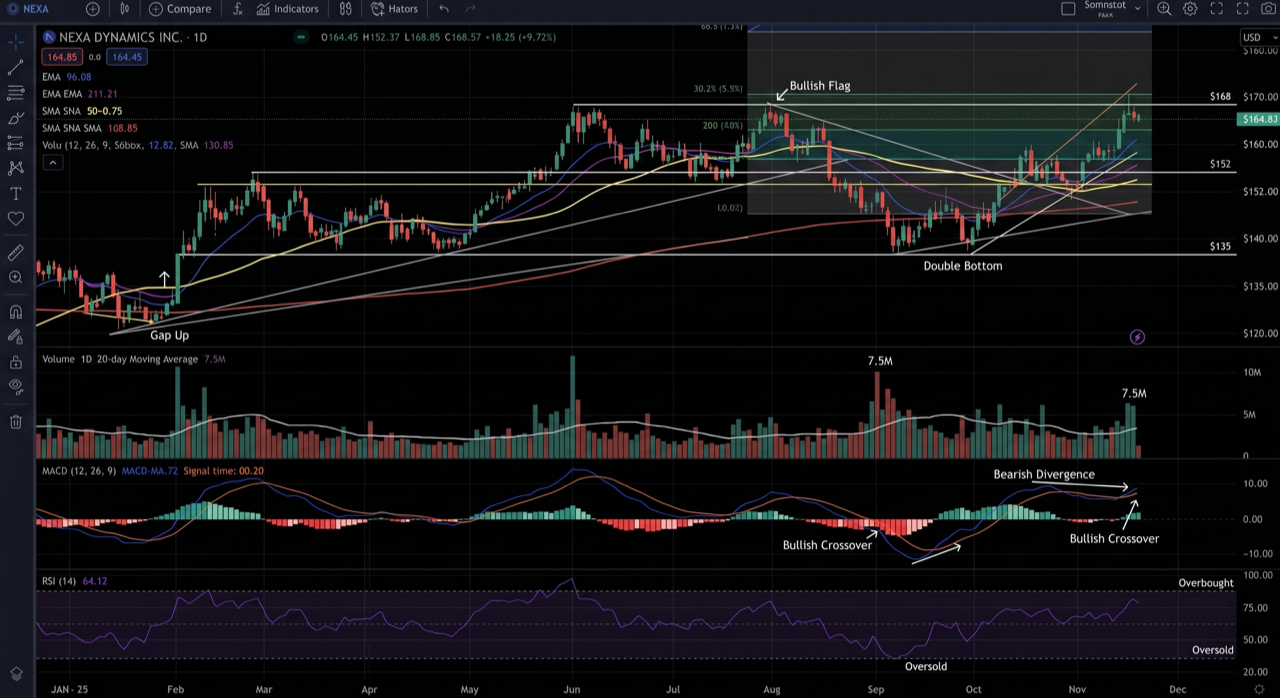
- A one-shot "understand this chart" turn: chart image in, grounded explanation out.
- A structured analysis (
{instrument, timeframe, trend, keyLevels[], pctChangeVisible, notableEvents[]}) you can automate against. - A verification step that catches the #1 failure mode: models misreading numbers off an axis.
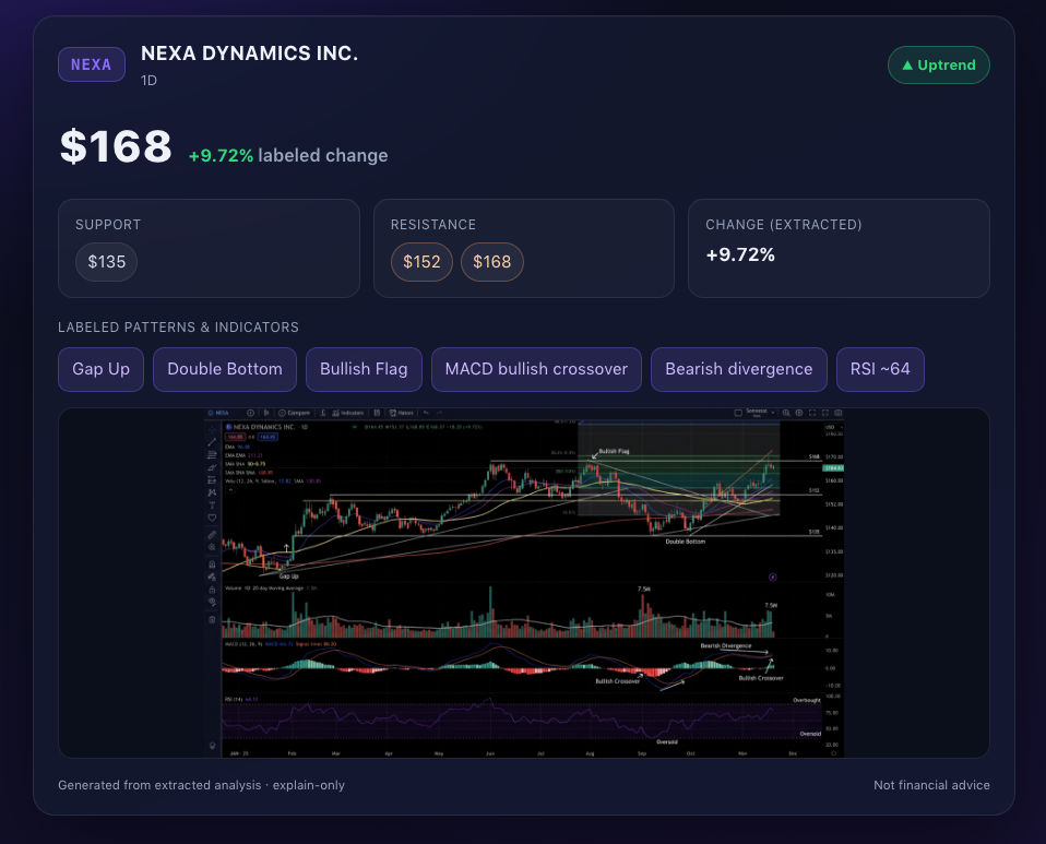
- A generated styled summary on OpenClaw's Canvas: build a polished HTML card from the Step 2 analysis (trend badge, support/resistance pills, pattern chips, embedded chart) and render it in the WebView.
- An iterative loop: drill in with follow-ups in the same session.
How it works
The key fact that shapes the whole recipe: Muse Spark is multimodal in, text out. Per the Model API factsheet, muse-spark-1.3 accepts text, image, video, and PDF and returns text. It understands the chart; it does not draw one. So the pipeline is:
Three Model API capabilities chain here, each with its own doc:
- Image understanding: the chart goes in as image content on a
usermessage (or viainfer ... --file). Verified working withmeta/muse-spark-1.3. - Structured output:
response_formatwith a JSON schema constrains decoding so the response matches the schema. It guarantees the shape, not that the model read the chart correctly (see Step 2 and Step 3). - Tool calling / the agent loop: OpenClaw turns the structured analysis into a rendered visual via the
canvastool or anexecre-render.
Because the model outputs text, the visual is a downstream render of the model's structured analysis. Do not reach for an image-generation model here: it would fabricate the data and defeat the point.
Step 0: setup
OpenClaw ships built-in support for the Meta provider, and muse-spark-1.3 is vision-capable — confirm the series foundation(opens in new tab) is connected (Meta provider selected), then put the bundled sample chart where the recipe expects it:
bash
Smoke-test vision on it:
bash
If it identifies it as a price/stock chart for NEXA, vision is wired correctly. Register the agent (enable the canvas tool, which is not in the default coding profile) and restart the Gateway:
json5
bash
Bringing your own chart? Drop any chart screenshot in as
~/chart-demo/charts/chart.png. Prefer one without third-party UI chrome or branding so the image stays yours to share.
Run the full pipeline (one task)
Give the agent a single task and let it drive the tools: analyze, save JSON, run render-summary.py(opens in new tab), present on Canvas. You do not hand-edit HTML or run the generator yourself.
bash
The agent reads the chart, writes analysis.json, execs render-summary.py (deterministic HTML from extracted values), then canvas navigate + present. The steps below break the same pipeline into smaller tasks for learning and capture.
Step 1: understand the chart
Start with the raw probe so you can see the model's reading without tools or session noise. The prompt does the explain-only enforcement:
bash
Representative output (real run against the bundled chart, condensed):
text
Wording varies run to run: the model reliably gets the instrument, trend, and labeled patterns, but hedges or marks "not readable" on precise prices, which is the behavior you want.
Then run it as the assistant experience (this is where Canvas/exec tools become available). Mention the image path and OpenClaw attaches it automatically:
bash
📸 Capture: the chart image plus the text explanation from both the infer probe and the agent.
Step 2: get a structured analysis
Ask for the analysis as JSON so it is automatable and easy to verify field by field.
In the agent, prompt for the schema:
bash
The agent prompt above asks for JSON but can't guarantee it. If you need the response to strictly conform to a schema, that's the Model API's structured output feature (response_format with a JSON schema, strict: true + additionalProperties: false) — it's a Chat Completions capability the OpenClaw CLI does not expose. See the structured-output docs to call the Model API directly when you need that guarantee.
📸 Capture: the structured JSON from the agent, noting any fields the model left empty or misread.
Step 3: verify the numbers (the objective backbone)
Models misread chart axes, so treat every extracted number as a claim to check against the image. Ask how each value was read, then verify by eye:
bash
Drop the same rule into the workspace AGENTS.md so every turn obeys it: state a numeric value only if it sits on a readable axis label or gridline, mark interpolated values (approx), say "not readable" instead of guessing, and never give advice. If a value is wrong, re-prompt with the labeled levels and have the model re-read against them.
📸 Capture: a before/after where the model corrects a misread level after being pointed at the gridlines.
Step 4: show the summary on Canvas
The model produced structured facts; now generate a styled page from them and put it on screen. Canvas(opens in new tab) is OpenClaw's agent-driven panel, a full WKWebView, so it renders real HTML/CSS, not just stacked text.
The finished card looks like the preview at the top of this guide. It is built by assets/render-summary.py(opens in new tab) from Step 2 JSON, then rendered in the Canvas WebView. Do not hand-write or edit HTML: the agent should save analysis JSON and exec the generator so the visual cannot drift from what the model read.
Prerequisite: a Canvas-capable node connected (the macOS app, Settings → Allow Canvas). Find its id:
bash
Task: render and present (recommended)
Ask the agent to run the generator and show the result on Canvas (same as the full pipeline, Step 4 only):
bash
Verified: the agent calls exec on render-summary.py, then canvas navigate + present. It does not rewrite the HTML by hand.
Manual render (debug only)
If you need to inspect the generator outside the agent loop, run it yourself:
bash
Copy the page into the macOS Canvas session folder and present it (local WebView path; avoids auth-gated gateway URLs):
bash
The HTML is built entirely from the extracted JSON. If a level is wrong, fix the analysis (Step 3) and re-run the task or generator.
Plain/quick alternative (A2UI)
If you only need text and no styling, push an A2UI(opens in new tab) card instead. It is instant but bland (this is the unstyled look):
bash
No Canvas surface (no macOS app)? Fall back to a plotted image: have the agent
execa small matplotlib script that draws the extracted levels, then send the PNG back over your channel. It is portable, but Canvas is the on-brand surface for an OpenClaw assistant.
📸 Capture: the canvas snapshot of the rendered summary card next to the original chart.
Step 5: iterate
This is an assistant conversation, so keep drilling in within the same session:
bash
Session continuity means the model still has the chart and prior analysis in context. Keep feeding the latest chart screenshot when the view changes (OpenClaw prunes image data from older turns, so the most recent image is what it reasons over).
📸 Capture: a two-turn drill-down and the updated summary.
Guardrails
- Explain only, never advise. Describe what is on the chart. No predictions, no buy/sell, no "is this a good entry." The prompts and
AGENTS.mdrule above enforce this; keep them. - Every number is checkable. The recipe's value is that extracted levels/percentages can be verified against the image. Lean into that.
- Text out, render separately. The model never draws the chart; a tool renders its structured output. Avoid image generation for data accuracy.
What to capture
- Chart + explanation: the input image and the text explanation (Step 1).
- Structured analysis: the JSON from the agent (Step 2), noting any fields the model left empty or misread.
- Verification: a misread value corrected after pointing at the gridlines (Step 3).
- Visual: the
canvas snapshotof the rendered summary card beside the original chart (Step 4). - Iteration: a follow-up drill-down in the same session (Step 5).
- (optional) trajectory export:
openclaw sessions export-trajectory --agent chartdemo --output chart-capture.
Gotchas
- Canvas viewport is short: the macOS Canvas panel is roughly 520×680px.
render-summary.pycaps chart height (default 320px) and top-aligns the page so snapshots do not clip the header/footer; tune with--chart-max-height. - Let the agent exec the generator: if you only say "build a fancy HTML card," the model may hand-write HTML. Task prompts should explicitly say run
~/chart-demo/render-summary.pyafter savinganalysis.json.
References
muse-spark-1.3(Model API docs): input text/image/video/PDF, output text; up to 50 MB inline, ~50 images per request. No image generation — the API does not produce media.- Structured output:
response_formatwithjson_schema(Chat Completions); usestrict: true+additionalProperties: false.image_urlis fetched server-side, so pass a public URL or inline adata:URI.