Error screenshot fix
Summary
This recipe shows how Muse Spark reads a screenshot of a buggy UI (via the OpenCode CLI), locates the offending component in the code, and ships a fix. The worked task fixes a footer-overlap bug reported against the cal.com monorepo(opens in new tab); the model helps the developer setup the project, reproduce the reported issue, and ship a fix to resolve the issue.
| Section | Use cases |
| Time to complete | under 30 minutes |
| Model | muse-spark-1.3 |
| Prerequisites | Python 3.10+, OpenCode CLI, and a MODEL_API_KEY (create one in the Model API dashboard). |
Configure OpenCode For Muse Spark
Install OpenCode with curl -fsSL https://opencode.ai/install | bash.
OpenCode has built-in support for the Meta provider.
First, get an API key from the Model API dashboard under API keys → Create API key.
Launch OpenCode, then run the connect command:
A searchable "Connect provider" list appears. Type to filter, select Meta, and confirm. Then paste the key from the dashboard into the "API key" prompt.
After connecting the provider, choose Muse Spark 1.1. The status bar should read Muse Spark 1.1 · Meta, confirming it's live.
Vision is essential here. Muse Spark 1.1 is a reasoning + vision model — that's what lets it actually read the screenshots the browser MCP returns. For a game, "does it look right?" is a question only vision can answer.
Verify Image Input Works
Before going further, confirm the image path end to end. Drop any screenshot next to your working directory and ask the model to describe it:
what's in ./assets/02-bug-attached.png?
If the model describes the image, image input is wired correctly — continue. If instead you see an error like "image not supported" or the model says it received no image, the screenshot is not reaching the model.
- Try reinstalling
opencodewith the latest version. - Reference the image by path in the prompt so the model calls
readon it, rather than pasting binary into the terminal.
Do not proceed until this smoke test passes — every step below depends on the model seeing pixels.
Setup the Sample Project
The sample project is the calcom/cal.diy(opens in new tab) monorepo at the commit immediately before the upstream fix PR (#29046(opens in new tab)) landed.
The fix is not in this commit, so the bug is live. Pin the clone to that commit:
bash
The walkthrough below has six steps. Your goal at each is what matters; the model's exact wording and turn count will differ from run to run (LLMs are non-deterministic — see the note below):
- Have the model set the project up and run a local app.
- Give it the bug report plus a screenshot, and get repro steps.
- Find a second instance of the same bug class while exploring the app.
- Hand both screenshots back in one prompt and have the model diagnose the shared root cause.
- Choose the fix scope (minimal vs. global) when it asks.
- Let it apply and self-verify the fix.
1. Set Up The Project Locally
User Prompt:
set up this project locally so i can repro the bug
Model Responds:
text
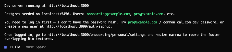
What to notice: The model runs the full setup itself — installs dependencies, seeds Postgres through Docker, starts the dev server, and reports back with the URL, the seeded login, and the page to navigate to. It tells the developer what it does not know (the seed user's password hash) instead of guessing.
2. Reproduce The Reported Bug
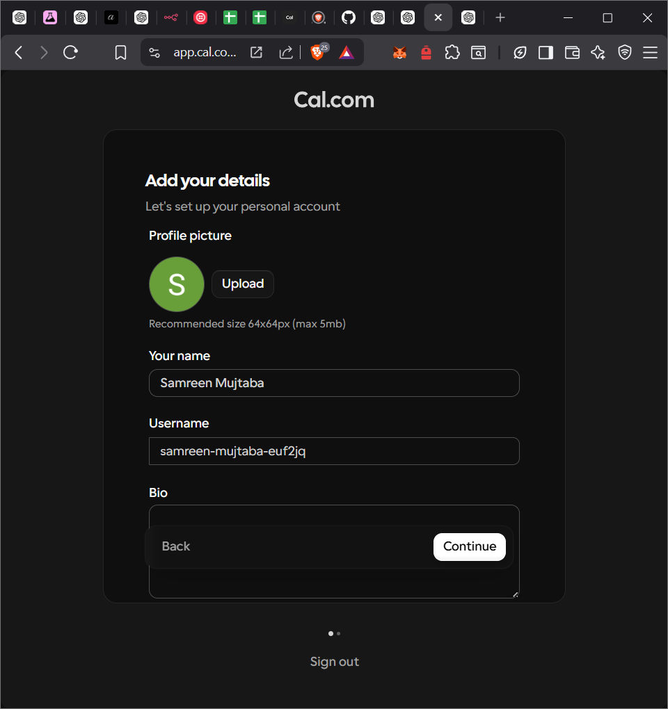
We'll consider this issue to fix: https://github.com/calcom/cal.diy/issues/28931(opens in new tab) The developer pastes the bug report text and attaches the screenshot the reporter included:
Check out this bug report:
Description. In the onboarding "Add your details" screen, the "Continue" button overlaps the Bio textarea when the viewport width is reduced (e.g., split screen / half window).
This appears to be a responsive layout issue.
Steps to Reproduce Go to onboarding (Add your details) Resize browser to ~50% width Scroll to Bio section Expected Behavior The "Continue" button should be placed below the Bio textarea without overlapping.
Actual Behavior The button overlaps the textarea, affecting usability and input interaction.
Then the developer asks to reproduce this bug on their local system
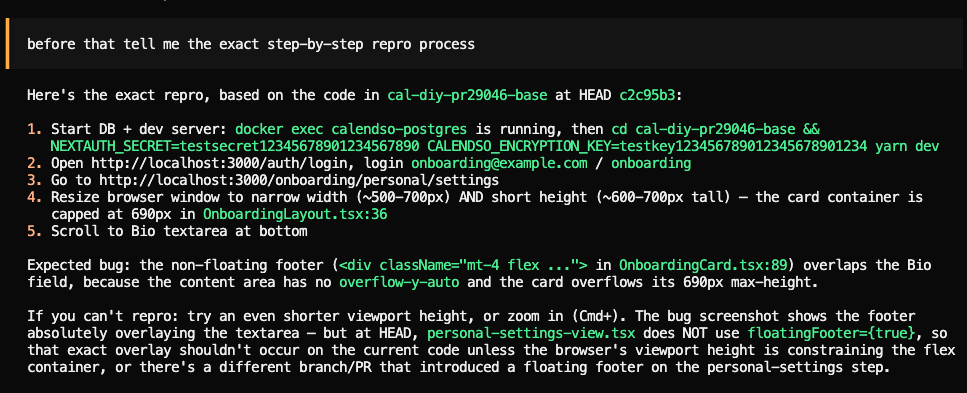
The model lays them out — start the DB and dev server, log in, navigate to the onboarding page, narrow the window and shorten it so the card overflows, scroll to the Bio field. The mention of both narrow width and short height is the part most readers miss; the bug needs the card's flex container to be constrained on the vertical axis.
3. Discover A Second Instance
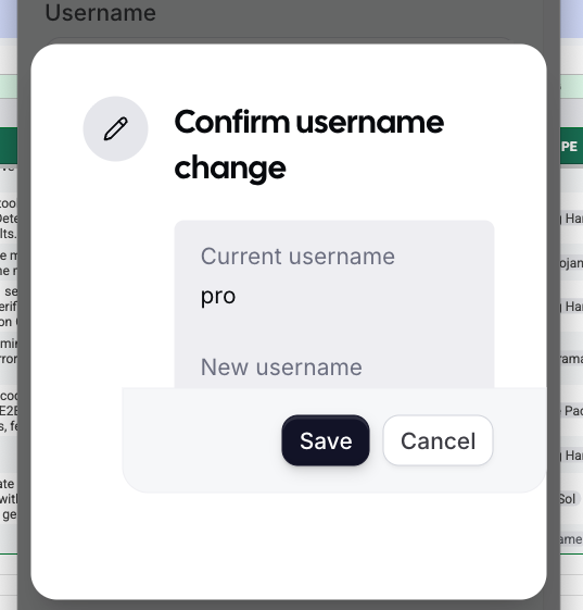
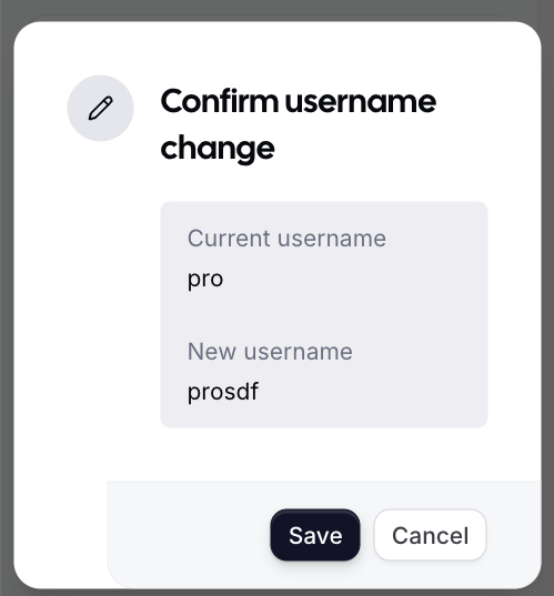
With the dev server running and the repro path in hand, the developer starts exploring other surfaces in the app. While updating their username under /settings/my-account/profile, they hit the same kind of footer overlap on a completely different dialog — and paste a screenshot of it straight into the chat.
Prompt:
ok not the same screen but i see this issue here also when i update my username [image attached]
What to notice: The developer pastes a clipboard screenshot from a different surface — the "Confirm username change" dialog at /settings/my-account/profile. The model reads it and recognizes the same root cause inside the shared Dialog component instead of inside the onboarding card:
text
The developer saves the clipboard image as repro.png and now has two screenshots of the same bug class on two different surfaces — exactly the setup the next prompt needs.
4. Read Both Bugs From The Screenshots
Prompt:
i am encountering an issue (see in repro.png) where there is an overlap that is preventing me from seeing the rest of the window. similar issue was reported (see bug.png) for a different menu. both are happening when the viewport is narrow. figure out what needs to change here and come up with a plan
What to notice: The developer starts a new session to save context. They switch OpenCode into Plan agent so the model proposes before it edits. The prompt names both screenshots by filename. Muse Spark uses read on each PNG before any source file. The first reasoning block ties the two images to "overlapping menus at narrow viewport widths" — diagnosis grounded in pixels, before any code.
Interleaved trace (thinking then action):
text
5. Localize The Components
What to notice: Each screenshot drives a separate search path. The model uses the dialog title text from repro.png to find confirm_username_change_dialog_title in the i18n bundle, then traces the key to its caller. For bug.png it uses the visible heading "Add your details" the same way. The screenshots replace the missing file paths in the report.
Interleaved trace:
text
By turn 19 the model has the two call sites and the two layout components. It has also noticed that personal-calendar-view.tsx already uses floatingFooter={true} with a scrollable container — the pattern that works, applied unevenly across onboarding steps.
6. Choose Minimal Vs Global
What to notice: Plan agent emits a question tool call before it commits to a fix shape. The model has already mapped the blast radius (one default in the dialog component, one in the card component, dozens of un-guarded callers), so the question is real, not a formality.
Question rendered to the developer:
Fix scope — Should I apply minimal targeted fixes, or also make global preventive changes to Dialog and OnboardingCard defaults?
| Option | What it changes | Trade-off |
|---|---|---|
| Minimal targeted fixes | The username dialog (enableOverflow) and the onboarding personal-settings step (floatingFooter + scroll). | Safest. Lowest risk of regressions. Same bug class can still ship on any other dialog or onboarding step. |
| Global preventive fixes (Recommended) | The DialogContent default overflow to overflow-y-auto, and the OnboardingCard content to overflow-y-auto by default. | Fixes both reported cases and prevents the same bug across all ~70 dialogs and all onboarding steps. Requires explicit opt-out on the one caller that depends on the old default (CommandDialog). |
The developer picked Global preventive fixes. The model then presented the plan:
The issue is two overlapping footer patterns, both failing in narrow viewports:
UsernameTextfield.tsx:166):DialogContent type="confirmation"hasmax-h-[95vh]butoverflow-visibleby default (Dialog.tsx:88).DialogFooteris sticky, but the parent isn't scrollable, so the footer overlaps content when the viewport is narrow. 2. Onboarding personal-settings (personal-settings-view.tsx:118):OnboardingCardfooter is not floating by default; the card content hasoverflow:hidden. When the viewport narrows, the footer overlaps the Bio textarea.Plan (Global preventive fixes): Flip the
Dialogdefault toenableOverflow={true}and theOnboardingCarddefault tofloatingFooter={true}; haveCommandDialogopt out explicitly to keep its cmdk dropdown working; update the dialog tests.This prevents the same bug in all ~70 Dialog usages and all onboarding steps, not just the two reported cases.
7. Apply The Fix In Build Agent
Prompt:
ok build it
What to notice: The developer switches OpenCode from Plan to Build with one phrase. The model lands four edits in order: the dialog default, the opt-out on CommandDialog, the onboarding card default, then the failing dialog test. It runs tsc --noEmit -p packages/ui/tsconfig.json and yarn test packages/ui/components/dialog/dialog.test.tsx itself, and when the original assertion no longer holds it updates the test rather than guessing.
Resulting diffs:
diff
diff
diff
diff
Validate Every Edit
The model verified the fix itself before handing off:
| Check | Command | Result |
|---|---|---|
| Dialog test suite | yarn test packages/ui/components/dialog/dialog.test.tsx | 9/9 pass |
| UI package types | npx tsc --noEmit -p packages/ui/tsconfig.json | 0 errors |
| Web app types | npx tsc --noEmit -p apps/web/tsconfig.json | 0 new errors (pre-existing trpc-generated type gaps unchanged) |
| Lint | yarn biome check --write (changed files) | 4 auto-fixes, no functional change |
After the developer confirmed the fix in the browser, they asked the model which other surfaces to spot-check. The model re-ran grep "DialogContent" and produced a list: every dialog with a sticky DialogFooter and potentially tall content is now scrollable by default. High-risk surfaces to verify in a ~360px × 600px viewport:
- Confirm username change (
UsernameTextfield.tsx) - Booking actions: no-show, reschedule, cancel, reassign, add guests, report
- Event types: new, duplicate, edit location
- Settings: add email, disable 2FA
- Availability: new schedule
- Bookings filters: save, rename, duplicate segment
- Apps: disconnect
Onboarding cards (all three now share the floating-footer + scroll pattern):
/onboarding/getting-started/onboarding/personal/settings(the originalbug.pngpage)/onboarding/personal/calendar
Browser confirmation:
OpenCode profile
Image input is a property of the model and the request shape: the harness only needs to successfully forward an image_url part to Muse Spark. Whether a given setup actually sends the image part is worth confirming — see Verify Image Input Works for the smoke test.
- OpenCode (terminal-native): reference the screenshot by path in the prompt; the model
reads it. Plan agent is read-only, Build agent applies edits. The focus of this recipe.
Common Failure Modes
Each mode below shows real output and the recovery.
The Screenshot Names The Wrong Component
When the screenshot does not include surrounding chrome (URL bar, viewport size, a stable component label), the model can land on a sibling component with the same visible heading. In Cal.com, the i18n key add_your_details is unique to the personal-settings onboarding step, so the model traced the heading directly to personal-settings-view.tsx. If the heading were generic ("Settings"), the model would have to disambiguate by URL.
Recovery: Include enough chrome that the URL or a stable label is visible, or paste the URL in the prompt alongside the screenshot.
The Model Fixes The Symptom, Not The Root Cause
A single screenshot pushes the model toward a single-file patch. With one screenshot, the model would change personal-settings-view.tsx to set floatingFooter={true} and stop — correct for that page, but the same anti-pattern would still ship in any future onboarding step and in ~70 unguarded DialogContent usages. The second screenshot is what forces the global frame:
text
Recovery: Attach a second screenshot of a related surface, or ask the model to grep for the same anti-pattern before editing. The Plan agent's question tool then makes the scope choice explicit.
A Default Flip Breaks An Opt-In Caller
Flipping a default (enableOverflow, floatingFooter) regresses any caller that relied on the old behavior. In this fix, CommandDialog needed overflow-hidden for its cmdk dropdown — flipping enableOverflow to true by default would have broken it. The model caught it before shipping:
text
Recovery: When flipping a shared default, grep for the existing default's known consumers and have them opt out explicitly. The recipe ships with that one-line opt-out as part of the diff.